24/07/22 - Making the UI suck less
The UI of Infinite Treasure has so far looked a mess. I'm not a designer by trade and while I've worked with a few in my time as a software engineer, I've not yet developed an "eye" for a great UI. As a result, my game's UI is full of "placeholder" white boxes and hideous font that represent buttons and panels.
I wanted to change that though. The UI is the first thing players see before jumping into the game - I don't want to put players off who might otherwise have played my game and given me some useful feedback. So the upcoming version, Alpha 7, focuses on cleaning the UI up. Under my hand, it'll never look beautiful but I knew I could improve it.
My strategy was to avoid making any overly complicated components - the simpler the design, the less likely I'd make a misstep in the aesthetics. I took some inspiration from a game I've enjoyed recently: Words Collide. The menus are simple and pleasant to look at - the main thing I learned from them is that text doesn't need to be expanded to take as much space as possible to be readable. Smaller buttons with smaller font makes the UI feel less crowded and blocky.
In terms of resources, I made use of two places:
- 1001freefonts.com - I found a decent free font called "Fredoka One", which has much more personality than the default Unity font
- flaticon.com - an incredible source of millions of free icons, as long as you attribute the authors! I'll be a making a page dedicated to attribution shortly and linking to it from my app page
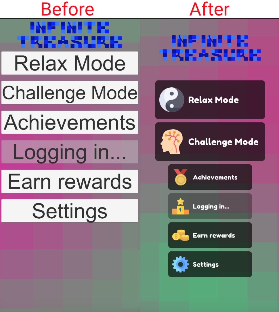
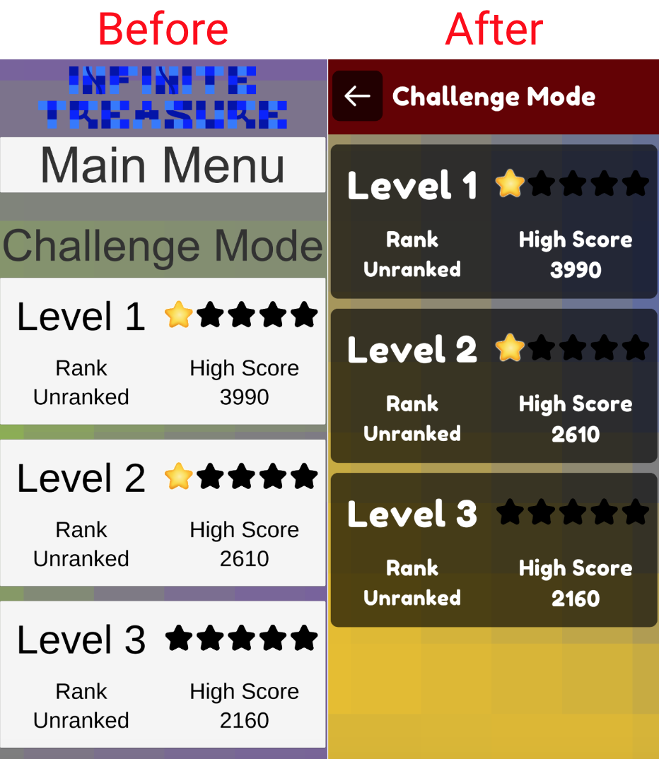
I removed the logo from each screen besides the main menu and rearranged the back button into a "title bar" with an icon button to go back. This has freed up a tonne of space on many screens where the top third used to be occupied by this non-content.
To make it easier to roll out a consistent theme, I've made a few different prefabs in Unity:
- Title: the bar at the top of the screen showing what the name of the screen is, with a coloured bar behind it to make it stand out. I've used a limited selection of colours for these bars to make each screen more distinct, and to make the Level Select menus for Relax Mode and Challenge Mode easier to distinguish
- Button: a button with a basic black background (slightly transparent to let the colours of the animated background come through) and text in Fredoka One font
- Icon Text Button: a Button prefab variant that adds one of the icons from FlatIcon
- Icon Button: another prefab variant with just an icon. I plan to make more use of these in future to simplify my menus further in places where a specific button is of low importance. For example, does Settings really need to be a full-size button on the main menu? Probably not
Here are some of the transformations:
This'll be the first of many iterations on the UI design - I'm learning a lot from other great mobile games and resources on design (I recommend the "Good Design, Bad Design" video series by Design Doc).
Once Alpha 7 is out, I will resume work on the actual gameplay - I have a plan to make Relax Mode much more compelling. Watch this space!
Leave a comment
Log in with itch.io to leave a comment.